Dual Y Axis for Two Sets of Data Series
The following example will demonstrate how to display two bar graphs with very large value differences on the same chart by using the dual Y Axis feature.
- Create a new graph by clicking Graphs → Add New Graph… in TechGraph Online’s navigation bar.
- In the TechGraph Editor, click on the X Data (Label) header and choose X Data Type: “Label” and Graph Type: “Bar”.
- Enter the following data into the Data Table. Optionally, you can change the Bar colors as shown below by simply clicking the Data Series cells in the top row to bring up a Graph Style menu box.
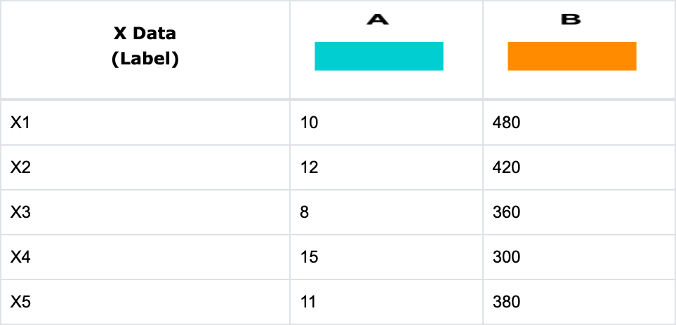
- The resulting chart with the very small Y values for data Series A is shown below. This is because the data range for Series A (0-15) is much smaller than the data range for Series B (0-480). When you display these two series together on the same Y axis, Series A is almost invisible compared to Series B.

- To add a second Y axis on the right side for Series B, click on the Curves and Error Bars icon in the Edit Chart sidebar menu. For the Graph B Y-axis field (a), select “Right Y”. The resulting chart is shown below with the additional Right Y-Axis scaled for the larger values.


Note: The above chart is drawn with automatic scaling for the Left Y and Right Y Axis. You can control the scaling of these two axes by clicking on the Y Axis icon to show the Y Axis Settings menu. You can select either Left Y or Right Y Axis in the Axis Selection field. Enter the minimum and maximum values, number of major divisions, number of minor divisions, linear or log, and break values to change the scaling for the axis.
Y Axis Break to Omit a Range of Insignificant Data
The following example will demonstrate how to break the Y-Axis to omit a range of insignificant data in Series A.
- Create a new graph by clicking Graphs → Add New Graph… in TechGraph Online’s navigation bar.
- In the TechGraph Editor, click on the X Data (Label) header and choose X Data Type: “Label” and Graph Type: “Line”.
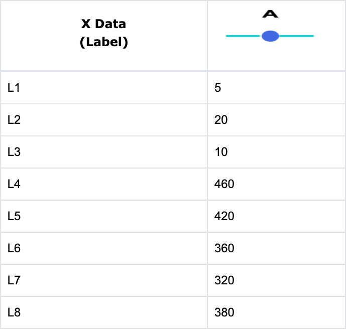
- Enter the following data into the Data Table. To match the line and marker colors used in this example, click the column header for Graph Series A and change Line Color to “DeepSkyBlue” and Marker Color to “RoyalBlue”.
- Click on the Settings icon in the Edit Chart tab and select the Line Style field for Series A. Check the Line with Markers option to add a marker at each data point. Optionally, by also checking the Print Data Value box in the Settings menu, the actual data for each series will be printed above the graph at each data location.

Note: For the above table there are two distinct ranges for Series A. The first three entries range from 5 to 20 and the remaining five entries range from 320 to 460. There are no data points between 30 and 300. You can use the Axis Break option in the Y Axis Settings menu to display two distinct ranges in the same chart area and to omit insignificant data with a break gap.
- Click on the Y Axis icon and the Left Y Axis Settings menu will appear. Enter “0” for Minimum and “500” for Maximum to set the data range for the entire Y axis. For the section that is before the break, enter “0” for Minimum Start, “30” for Maximum End and “2” for Major Div.
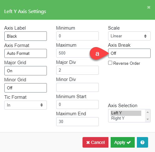
Note: The Axis Break option (a) will change to “On” once the Enable Check option is checked in the Left Y Axis Break menu.
- Next, click on the Axis Break field to display the Left Y Axis Break menu. For the break location, enter “30” for From and “300” for To. Enter “30” for At(Percent) to break at the one third point. For the section of the axis after the break, enter “350” for Minimum Start, “500” for Maximum End and “3” for Major Div. Make sure the Enable Break box is checked to enable Axis Break option in Left Y Axis Settings menu.

- You will see a chart like the one below once you have entered the values to beak the axis as described above in the Y Axis Settings and Left Y Axis Break menu. (A chart background color has been added in this example to make the break more visible.)

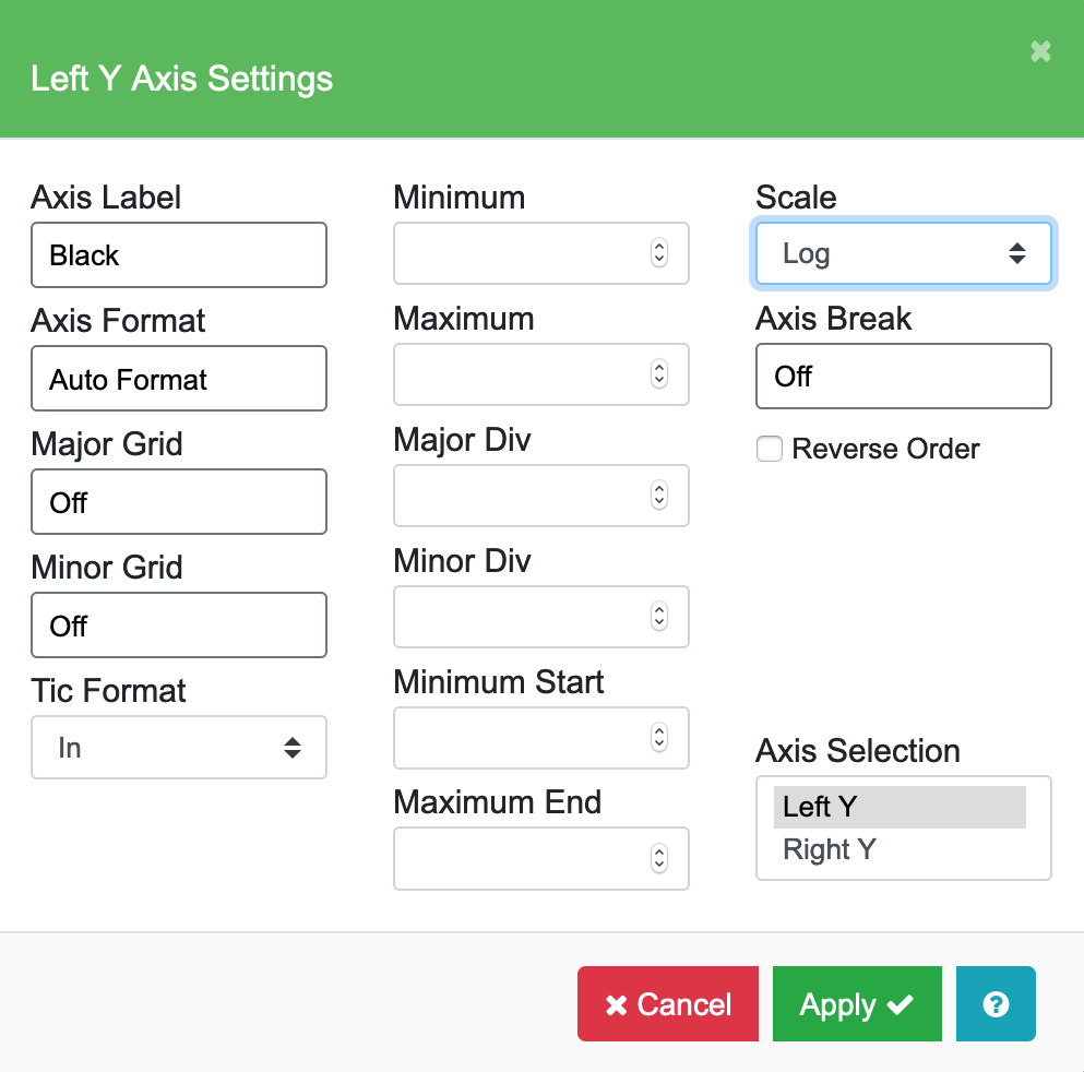
Set Y Axis to Log Scale
Use Log Scale to display a set of numerical data that has a very wide range of values, with the largest numbers many times larger than the smallest numbers. An exponential growth curve is a good example of a data set that should be displayed in a log scale as shown in the following example.
- Create a new graph by clicking Graphs → Add New Graph… in TechGraph Online’s navigation bar.
- In the TechGraph Editor, click on the X Data (Label) header and choose X Data Type: “Number” and Graph Type: “Line”.
- Enter the following data into the Data Table.
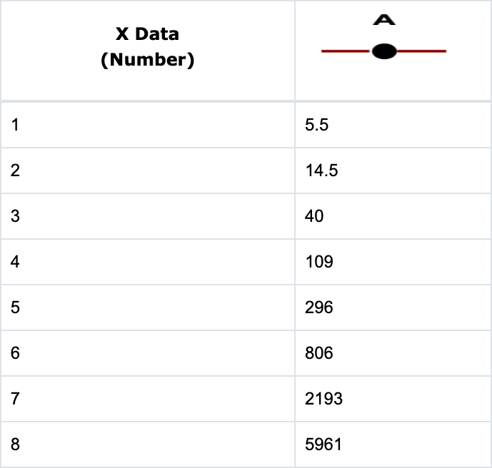
- Switch to the Edit Chart tab. Click on the Settings icon in the sidebar menu and select the Line Style field for Series A. Check the Line with Markers option to add a marker at each data point.

- Click on the Y Axis icon and the Left Y Axis Settings menu will appear. Change the Scale option (highlighted in blue below) to “Log” to show the Exponential Curve in log scale.