

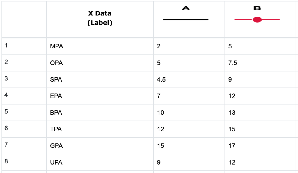
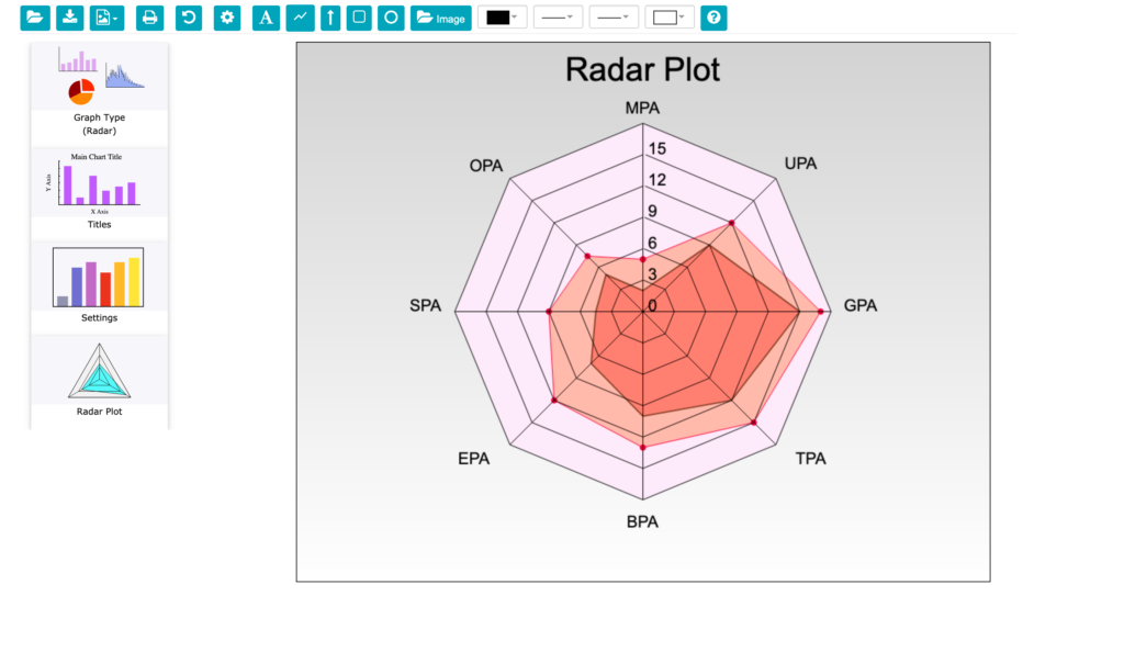
The Radar Plot Graph Type is similar to a Polar Plot except the X data are labels rather than angles. The radar plot consists of a sequence of equi-angular spokes, called radii, with each spoke representing one of the variables. Below is the data table for a radar chart with eight spokes.
When you choose “Radar” from the Graph Type icon menu, you will notice the X Axis, Y Axis, and Curves & Error Bars options are not available for Radar Plots. However, Titles and Settings icons are still available to add titles and set the styles for the radar chart.
Radar Plot Settings
When you click on the Radar Plot side menu icon, the Radar Plot Settings menu will appear. The Radar Plot Settings menu below allows you to control the features particular to the Radar Plot and are divided into Angle and Radius sections as shown below.
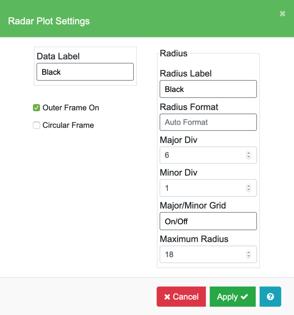
| Data and Radius Label | These fields allow you to change the color, font, size of the text, and add italics and bold. The data labels will be located around the plot circumference. The radius labels will be located along the zero axis horizontally from the center. |
| Radius Format, Major Div, Minor Div, Major / Minor Grid | These functions are exactly the same as described above in the Polar Plot section. |
| Maximum Radius | You can choose the maximum value for the Radial axis. The minimum value for the Radius axis is always zero. |
| Outer Frame On | When this option is checked, the outer frame line is drawn. |
| Circular Frame | When this option is checked, a circular frame is drawn. |


Radar Chart Settings
With the Graph Type “Radar” selected, click the Settings icon to show the Radar Chart Settings menu. Use this to set the color, line style, fill color, and marker style for each graph, legend text and position, and frame background color as in previous Chart Settings menus. The example below shows some customization of these settings.
