
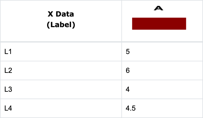
When you enter your data in a column format in the Data Table tab, you get a bar graph with equally spaced bars, each with the same pattern and color. View the chart in the Edit Chart tab.

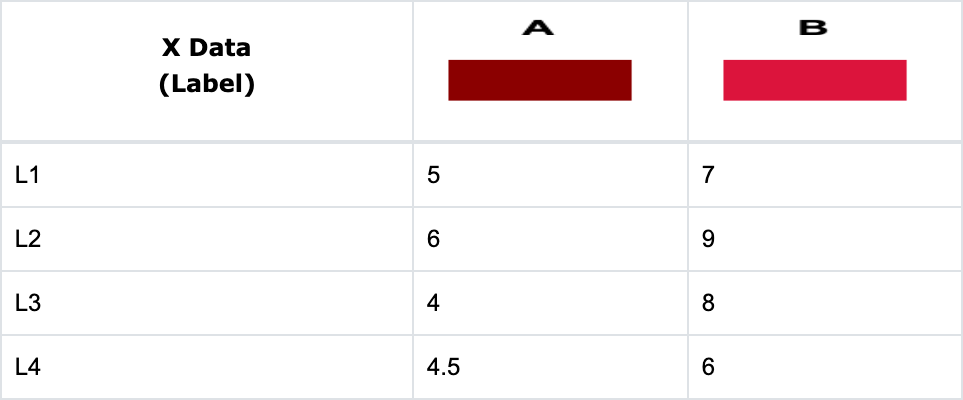
Now enter a series of data in column B, and you get a comparable bar graph where each entry in column A is drawn side-by-side with the corresponding entry in column B.

You get a stacked bar graph when you check the Stack Data option in the Settings menu located in the Edit Chart sidebar. Here, each entry in Graph B is drawn on top of the corresponding entry in Graph A. When you check the Print Data option in the Settings menu, the TechGraph Editor will show the summation value of each entry for Graphs A and B by printing the value on top of Graph B.

Check the Horizontal Bar option in the Settings menu to display a bar graph in a horizontal orientation with the X axis on the left side and the Y axis at the bottom.


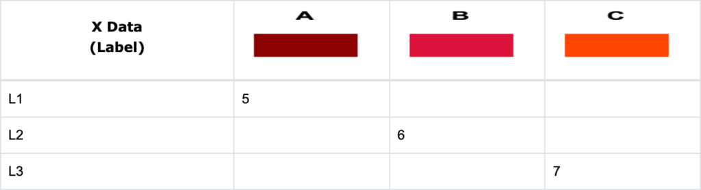
Bar Graph with Individually Colored Bars
If you want to change the above bar graph so that each bar has a different color and/or pattern, you will need to place each value in a different column to get a different pattern and color assignment.
- Select the Data Table tab.
- Click the Reset Chart
 button. Choose X Data Type: “Label” and Graph Type: “Bar”.
 - Enter the data below into the Data Table.
- Select the Edit Chart tab. In the side menu, go to Settings, and check the Stack Data box. The graph below on the left is without Stack Data enabled. The graph on the right is with Stack Data checked.


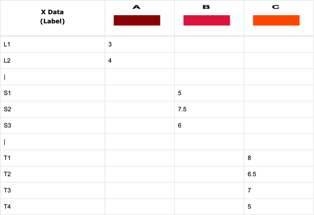
Bar Graph with Grouped Bars
This example demonstrates how to create a chart with groups of bars with the same color. You can also create a “gap” between the groups and adjust the bar width for the group of bars.
- Select the Data Table tab.
- Click the Reset Chart button. Choose X Data Type: “Label” and Graph Type: “Bar”.
- Enter the data below into the Data Table. Note that a dummy row (a micro space character in X Data Column) is inserted in Row 3 and Row 7 to create the “gap” between groups of bars.
- Switch to the Edit Chart tab. Go to Settings, select the “Histogram” Format in the Bar Format submenu, and change the Width from 100 to 90 to get very small gaps between bars. Make sure you enable the Stack Data option in the Settings menu as before.


