


The Chart Settings dialog box allows for a multitude of functions.
| a. Legend Text | Enter the legend text for each graph series |
| b. Graph Type | For Bar, Line, Scatter and Area graphs, you can turn a series on or off on the active graph. For a Combo Graph, you can select the graph type for each series. |
| c. Graph Style | Set colors, pattern types, and marker types for Bar and Scatter Graphs. For a Line Graph, set line colors and width, add markers, and fill patterns below the graph. |
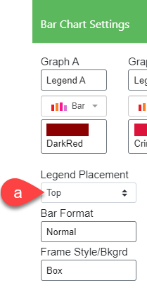
| d. Legend Placement | Specify the Legend Placement of the chart: Top, Bottom, Right, Left, or None |
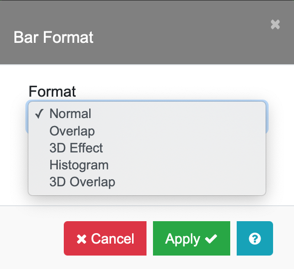
| e. Bar Format | Choose a Normal, Overlap, 3D effect, Histogram, or 3D Overlap Bar Format and set the relative bar width |
| f. Frame Style | Set the background color and thickness of the axis frame |
| g. Print Data Value | Print the data value on the graph |
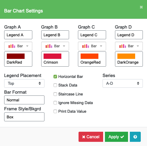
| h. Horizontal Bar | Rotate a bar graph horizontal |
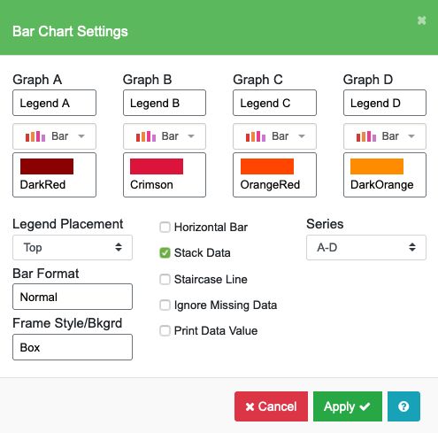
| i. Stack Data | Stack the graphs |
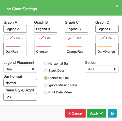
| j. Staircase Line | Use a Staircase Line on a Line graph |
| k. Ignore Missing Data | Ignore missing data points |
| l. Selection | Use the Series Selection to see more series |
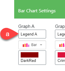
Legend Text
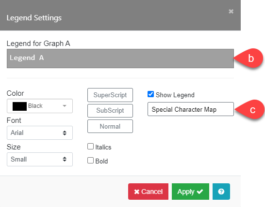
The Legend field (a), will bring up the Legend Settings menu. Enter the Legend text for each Graph series in the entry field (b). Special characters – European, Math, and Greek – are available in the Special Character Map (c). Subscripts and superscripts can be selected by highlighting characters, then checking the appropriate box. To hide a legend for this series, simply uncheck the Show Legend box. You can select the color, font, size, weight, and style of the legend text. These selections are “global” and will be applied to all series legends.
Graph Type
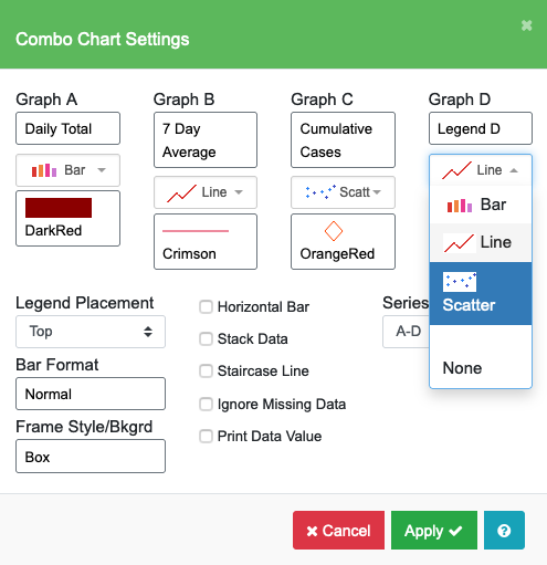
The Graph Type button shows you the type of graph you chose when first creating the Chart. You will not be able to change the graph type here, unless you chose “Combo” originally. If you chose “Combo” as your main graph type, then you can set the graph type for each individual series to Bar, Line, or Scatter. Bar chart is the default for all series. You can suppress plotting a series of data on any graph type by selecting “None”.
Graph Style
The style choices will be unique for each graph type.
- For a Bar graph, you can select the color and pattern for the bars.

- For a Scatter graph, you can select the color, type, and size of the Markers.

- For a Line graph, you can select the color, thickness, line type, and markers. A useful option is to shade the area below a line. Check the Fill Below Line box (d) and the area below the line will be filled using the Fill Color selected for the line (b) and pattern selected in Pattern (c). Examples are shown below.
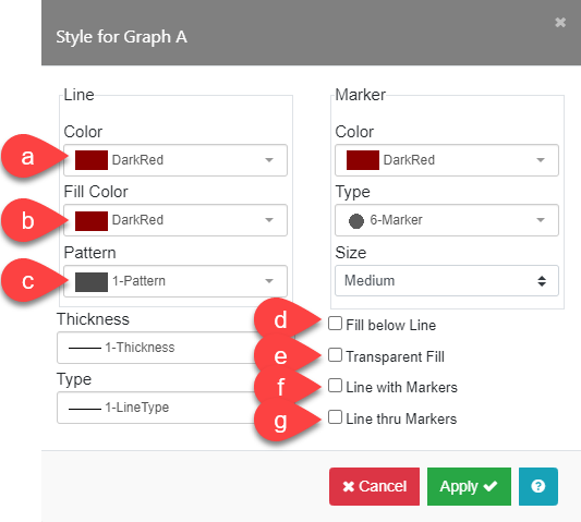


- When you enable Fill Below Line (d), you can check the Transparent Fill (e) option so you can see through the background fill area.
- Use the Line with Markers (f) option to add a marker at each data point. The color, type of markers, and size is determined in the Marker section. Use Line thru Markers (g) to control whether a gap is left before and after each marker.


Legend Placement
The legend can be placed at four preset positions; Top, Bottom, Right, or Left. Additionally, the legend can be moved anywhere by clicking and dragging the legend in the Edit Chart tab. An example of a legend on the left of the chart is shown.

Bar Format
There are five Bar Format (a) choices: Normal, Overlap, 3D Effect, Histogram, and 3D Overlap. You can change the color and width of the bars. Examples of each format are shown below.
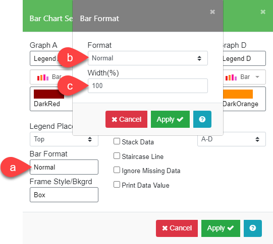
- The bar Width (c) only applies to when Format is Normal. 100% is default.


- Examples of the other format types are shown below.


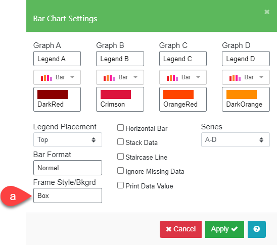
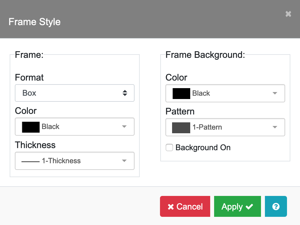
Frame Style and Background
You can modify the chart using the Frame Style/Background options located in the Bar Chart Settings menu. There are two sections: Frame and Frame Background.
- Use the Frame Style/Background field (a) to bring up the Frame Style submenu. Select “None”, “Left”, or “Box” from the Format list. The “Left” choice frames only the left and bottom axes. Select the color of the line used for the Axis Frame itself. Control the thickness of the line used for the axis frame using the Thickness choices.
- In the Frame Background section, choose a color and pattern to add background to the Frame (graph area). Make sure Background On is checked to display the frame background.
Print Data Values
By checking the Print Data Value box, the actual data for each graph will be printed above the graph at each data location. Examples are shown below for a Bar chart and a Line chart.


Horizontal Bar
This option displays a bar graph in horizontal orientation, with the X axis on the left side and the Y axis at the bottom. This option is only available for bar graphs with “Label” as the X Data Type. No curve fits or equations can be plotted on horizontal bar graphs. Examples are shown below.


Stack Data
You can stack Bar and Area graph data. Each series is plotted on top of the previous series. Generally, Area graph data should always be stacked. Area graph data is automatically stacked when the Graph Style is “3D Effect”.


Staircase Line
Use Staircase Line to connect points on your Line graph with horizontal and vertical line segments. The resulting graph will look like a series of steps, or a staircase.


Ignore Missing Data
Use the Ignore Missing Data option to make a line graph continuous in spite of missing data values (X but no Y). With this box unchecked, a gap for the missing value(s) will be displayed as shown below.


