

Select the Graph Type for each graph by choosing from the icon list shown below.
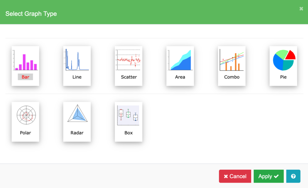
Bar graphs are best for showing comparisons between groups of data. Stack bars to show each series’ contribution to the total. Use “Label”, “Number”, or “Time Series” as the X Data Type.
Line graphs are best for showing trends or changes in data over time. Data points are connected with a straight line; markers are optional. If you will be adding a curve fit, use a scatter graph. Use “Label”, “Number”, or “Time Series” as the X Data Type.
Scatter graphs are best for showing data distribution. Points are plotted with markers but no straight line connector is added. You can add a curve fit or equation to this type of plot. Use “Label” or “Number” as the X Data Type.
Area graphs are best for emphasizing the size of the total data. Stacked area graphs show how each series contributes to the total. Use “Label” or “Number” for X Data Type.
Combo graphs allow you to set the graph type for each data series individually. You can mix Bar, Line, or Scatter types on one graph.
Pie Charts are best for showing how each part contributes to the whole. They use “Label” as the X Data Type.
Polar graphs display your data in the circular polar coordinate system. Polar Coordinates consist of paired data (radius, angle) where the radius is the distance from the center and angle is the angle of rotation from a particular reference point in the coordinate system.
Radar graphs consist of a sequence of equal angular spokes, called radii, with each spoke representing one of the variables.
Box-Whisker graphs enable you to analyze data arranged in columns. You have options to display summary statistics that allow you to analyze the distribution of groups of data.