
There are two options to generate a curve fit:
- The fast and simple method uses the Curves and Error Bars option in the Edit Chart tab. You can select from a list of default equation types: linear, exponential, log, power, spline and polynomial up to the 6th order. An equation is generated for the data series that is associated with the curve fit selection and plotted on the chart easily.
- The advanced method uses the Curve Fitter button in the Data Table toolbar. The Linear Curve Fit options will calculate the best fit for your data from all 100 built-in Linear functions: Linear (40 functions), Exponential (10 functions), Power (25 functions), and Polynomial (25 functions). Check the ID box for any number of functions that you think might fit your data. There are 5 fit statistics that can be saved and displayed on the graph: Y Predict Equation, Predict Values, Residuals, Confidence Interval and Prediction Interval. A statistical report is generated and saved and can be exported for further use.
Generate and Plot a Simple Exponential Curve Fit
- Create a new graph by clicking Graphs → Add New Graph… in TechGraph Online’s navigation bar.
- In the TechGraph Editor, click on the X Data (Label) header and choose X Data Type: “Number” and Graph Type: “Scatter”.
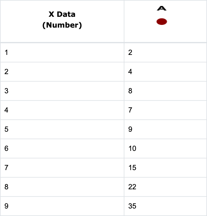
- Enter the following data into the Data Table.
- Select the Edit Chart tab.
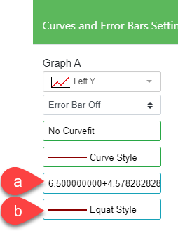
- Click on the Curves and Error Bars icon in the side menu. Click on the No Curvefit field (a) and the Curvefit Selection for Graph A submenu will appear. Select “Exponential” from the Selection field (b).
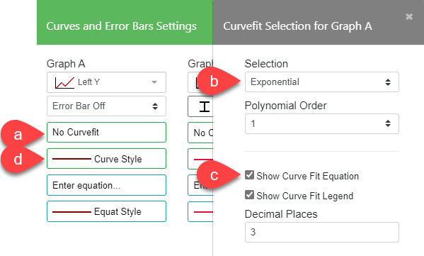
- Click Apply twice and the graph and equation shown below will be displayed.

Note: When you edit the data values associated with the curve equation, the coefficient values of the equation will change automatically during a redraw.
The exponential equation is initially shown in the middle of the chart. Select the equation and grab the middle bubble to move the equation to a new location on the chart. To suppress the display of the equation, uncheck Show Curve Fit Equation (c) in the Curvefit Selection submenu.
- To change the color and style of the above curve fit line, select the Curves and Error Bars icon again, and then click on the Curve Style field (d) to bring up the Curve Style submenu for Graph A. Check Fill below Curve and Transparent Fill to fill the area below the curve. The Curve Color is set to “Black” and the Fill Color is “DarkRed”.


Generate and Plot an Advanced Linear Curve Fit
- Select the Data Table tab.
- Click the Reset Chart
 button and choose X Data Type: “Number” and Graph Type: “Scatter”.
 - Enter the following data into the Data Table:

- Click the Curve Fitter button on the Data Table toolbar and select Linear Curve Fit from the dropdown list. The Linear Curve Fit menu appears. Let’s assume a polynomial curve will best fit the data. Scroll down in the Selection list until you find the polynomial equations. Select equations 76 through 78 which are the second, third, and fourth order polynomial equations. Then enter “X” in the X Data Col field, “A” in the Y Data Col field, “1” in Start Row, and “8” in End Row.
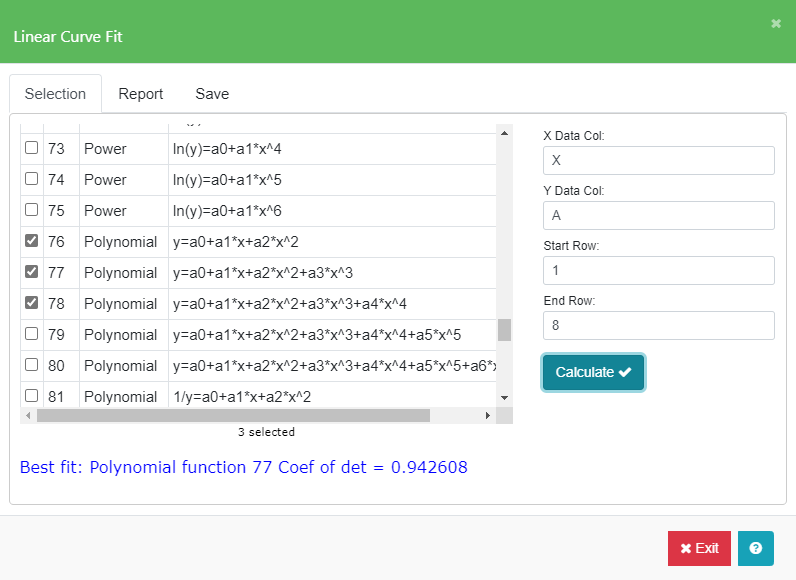
- Click Calculate. After a successful fit calculation, the Coefficient of Determination of 0.942608 for the best fitted polynomial equation is shown at the bottom of the menu. In this case, equation 77, the third order polynomial, was the best fit.
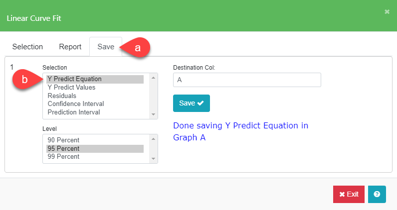
- Select the Save tab (a) in the Linear Curve Fit Menu. Select “Y Predict Equation” (b) from the Selection list. Enter “A” in the Destination Col field and click Save. A curve fit equation is generated and saved in the Graph A Equation field of the Curves and Error Bars menu in the Edit Chart tab.
- Click on the Edit Chart tab after you exit the Linear Curve Fit menu and the following chart will be shown.

Note: The polynomial equation is initially shown in the middle of the chart. Select the equation and grab the middle bubble to move the equation to a new location on the chart.
When you edit the data values associated with the Linear Curve Fit equation, you will need to redo steps 4 to 6 to get the updated coefficient values of the equation.
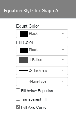
- Click on Edit Chart tab and then click on the Curves and Error Bars icon. The equation field (a) shows the Y Predict Equation that was saved from Step 6. Click on the Equation Style field (b) and the Equation Style menu appears. Change Equat Color to “Black”, the Line Thickness to “2-Thickness”, and Line Type to “4-LineType”. Fill Color does not matter in this case.
- The resulting chart will be displayed with the data and the polynomial equation will be drawn with the new color, line thickness, and line type.
