

Box-Whisker Graphs display summary statistics that allow you to analyze the distribution of groups of data. They enable you to analyze data arranged in columns.
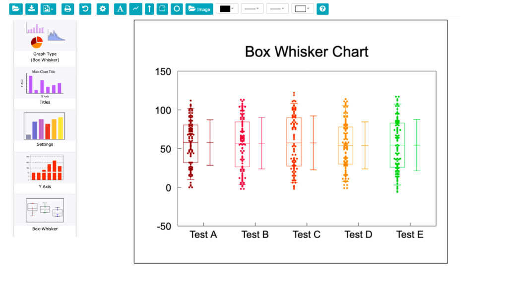
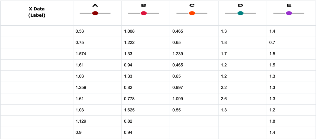
When you choose “Box” from the Graph Type icon menu, you will notice the X Axis, Y Axis, and Curves & Error Bars options are not available for Box-Whisker graphs. However, Titles and Settings icons are still available to add titles and set the styles for the chart. Data for a Box-Whisker graph is always entered in Graph Series A through P. The X Data column is not used. Below is an example of a Box-Whisker graph with five columns of sample data. To label Graph series A as “Sample A”, Graph series B as “Sample B”, etc. as X Axis tic labels, click on Settings to show the Box-Whisker Chart Settings menu and then select the Legend field for each graph series to change the legend text.
The columns of data are analyzed as independent populations. Each column of data is sorted and the mean, median, and the 5th, 25th, 75th, and 95th percentile and the confidence interval about the median (used for the notch) calculated. This information is then used in the Box-Whisker graph as follows:
- The box shows the range between the 25th and 75th percentiles.
- The horizontal line indicates the median value.
- The whiskers extend from the edge of the box to the 5th and 95th percentiles.
- The notch (optional) shows the confidence interval about the median.
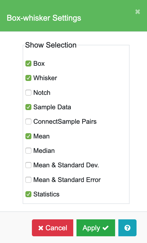
Box-Whisker Settings
Click on the Box-Whisker icon on the Edit Chart sidebar and the Box-Whisker Settings menu will appear.

| Box | Draws a box from the 25th to 75th percentile of the data. |
| Whisker | Draws error bars or “whiskers” from the edge of the box to the 5th and 95th percentile. |
| Notch | Displays a notch in the box. The length of the notch is the confidence interval about the median. The notches surround the medians and provide a measure of the significance of differences between groups. If the notches about two medians do not overlap, the medians are, roughly, significantly different at about the 95% confidence level. |
| Sample Data & Connect Sample Pairs | Displays markers for each of the samples in the group. Markers are drawn in a column at the center of the box. |
| Mean | Draws a horizontal line across the box showing the mean for the data. |
| Median | Draws a horizontal line across the box showing the median for the data. |
| Mean & Standard Dev | Enabling this option draws an error bar showing the Mean and Standard Deviation (to the right of the box if it is plotted). |
| Mean & Standard Error | Enabling this option draws an error bar showing the Mean and Standard Error (to the right of the box if it is plotted). Connects pairs of samples with a line. Enter your pairs in Graph Series A and B, C and D, etc. |
| Statistics | Prints a table of summary statistics below the graph: sample size, 5th, 25th, 50th, 75th, and 95th percentile, mean, and notch value. |
Example: Box-Whisker graph with Box, Whisker, Sample Data, Mean, and Statistics enabled.

Note: The Titles sidebar icon allows you to add titles to the chart. The Settings sidebar icon allows you to set the marker style (color, size, and type) for the sample data for each graph series, and line color and thickness for displaying whisker boxes, mean, median, and connecting lines. Legend text to label the X Axis is also entered in the Settings menu. There is also a Y-axis icon which you should use to control the scaling.