

Options for four series of data are displayed at a time. To see more series, select a different interval from the Selection box at the lower right corner of the Curves and Error Bars Settings menu.
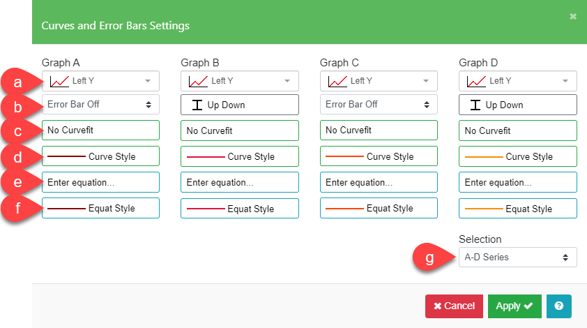
| a. Left / Right Y Axis | Plot individual series against the left or right Y axis |
| b. Error Bar | Plot series of data as error bars and select the format for the error bars and significance markers. |
| c. Curve Fit* | Select an automatic curve fit for your data. |
| d. Curve Style | Select the line style and color for the curve line and fill area. |
| e. Enter Equation | Plot user-defined equations of the form y = f(x). |
| f. Equation Style | Select the line style and color of equation line and fill area. |
| g. Selection | Choose the set of graph series from A-P in groups of four. |
*Use this option for quick curve fitting. More complex fits can be performed using the Curve Fit options in the Data Table menu.
Left / Right Y Axis
If your Y data spans two different ranges, you can select both an independent Left and Right Y Axis. By default all series are plotted against the left Y axis. The Right Y axis will be drawn if the Right Axis is selected by at least one data series. Refer to the Y Axis Settings for Y Axis scaling. See examples below where Graph Series A is set to Left Y Axis while Graph Series B is set to Right Y Axis.


Error Bar
Error Bars are used to indicate the uncertainty in a value. They show the positive or negative error associated with each data point. When you use error bars, Graphs A, C, E, etc. are taken as data values. Graphs B, D, F, etc. are the corresponding error values. When you select the Error Bar field (a), the Error Bar Format submenu will appear to allow you to turn on the error bars and select the error bar options.
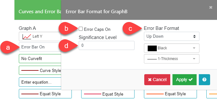
| a. Display Error Bars | Turn on the error bars for the series. |
| b. Error Bar Cap On | Display caps on the error bars. |
| c. Error Bar Format | Choose the direction for the error bars. Choose the color and thickness of the error bar line |
| d. Significance Level | Display significance markers (*) with the error bars to indicate significance or mark for footnotes. |
The Error Bar Formats have the following meanings:
| Format | Meaning |
|---|---|
| Up Down | Error both plus and minus from data |
| Up Only | Error positive, bar up – error negative, bar down |
| Down Only | Error positive, bar down – error negative, bar up |
| From Zero | Error positive if data >= 0, negative if data < 0 |
| Toward Zero | Error negative if data <= 0, positive if data > 0 |
| Left Right | Error both plus and minus in X direction |
Notes:
- Error bars are always drawn with a solid line pattern.
- Error bars are not drawn if the error is smaller than the marker size.
- Error bars are displayed only when the Graph Type selected for Graphs A, C, E, etc. is “Bar”, “Scatter”, or “Line”.
- Error bars are not displayed when Graph Style is set to “Overlap” or “3D Overlap”.
- Left Right error bars are only displayed with the X Data Type of “Number”.
- Left Right error bars are not displayed on Horizontal Bar graphs.
Example – Error Bar Formats
The examples below were plotted using the Error Bar Format of “Up Down” and “From Zero” and the following data:


| Graph A (data value) | Graph B (error value) |
|---|---|
| 20 | -10 |
| 50 | 12 |
| 80 | 15 |
| -20 | -8 |
| 70 | 13 |
| 80 | 12 |
Example – Error Bars in Two Directions
To get both vertical and horizontal error bars on a single series of data, you must duplicate the data in two columns in the graph Data Table Form with the associated errors in the adjacent column. This example uses the following steps:
- Select the Data Table tab and click on the X Data Type column header. Select “Number” for X Data Type and “Scatter” for Graph Type.
- The data is entered in Graph A and duplicated in Graph C. The vertical (Y) errors are placed in Graph B and the horizontal (X) errors are placed in Graph D.
| X Data | Graph A (data) | Graph B (Y error) | Graph C (data) | Graph D (X error) |
| 15 | 20 | 6 | 20 | 5 |
| 30 | 50 | 7 | 50 | 8 |
| 40 | 80 | 8 | 80 | 9 |
| 50 | -20 | 5 | -20 | 7 |
| 60 | 70 | 6 | 70 | 7 |
| 80 | 80 | 7 | 80 | 8 |
- Select the Edit Chart tab and click on the Settings sidebar button. Select identical markers for Graph A and Graph C.
- Select the Curves and Error Bars sidebar button. Check Error Bar On for Graph A and set the Error Bar Format to “Up Down” for Graph B. Next, check Error Bar On for Graph C and set Error Bar Format to and “Left Right” for Graph D.

Significance Markers
Use this option when you want to display asterisks above an error bar to indicate significance or to use for footnotes. To display significance markers with error bars…
- Enter your data and error values. Enter negative errors only where you want to display significance markers.
- In the Curves and Error Bars menu, set the Error Bar Format to “Up Down”, “From Zero” or “Toward Zero” to suit your needs. Significance markers are not displayed for “Up Only”, “Down Only,” or “Left Right” Formats.
- Set the Significance Level to the number of asterisks you want to display. The default is 0, the maximum number is 6.
- Display your graph – the markers will be displayed above the error bar for positive data values and below the error bar for negative data values.
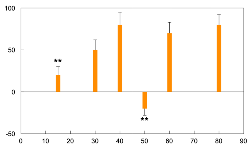
Example – Significance Level
The bar chart shown below was plotted with the following data set:
The Error Bar Format is set to “From Zero” and the Significance Level set to “2”. Notice the position of the significance markers for the first and fourth bar.
| Graph A (data value) | Graph B (error value) |
|---|---|
| 20 | -10 |
| 50 | 12 |
| 80 | 15 |
| -20 | -8 |
| 70 | 13 |
| 80 | 12 |
Curve Fit
The Curve Fit option in the Curves and Error Bars Settings menu can be used to perform quick curve fits. More complex fitting can be performed using the Curve Fitter options in the Data Table tab toolbar.
The Curve Fit derives an approximating function using a least squares regression. The curve fits are performed according to the following formulas:
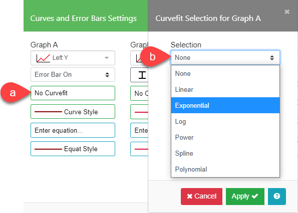
| Linear | Y = a0 + a1X |
| Exponential | Y = a0 ea1X |
| Log | Y = a0 + a1ln(X) |
| Power | Y = a0 Xa1 |
| Polynomial | Y = a0 + a1X + a2X2 +… + a6X6 |
| Spline | (no coefficients reported; requires at least 4 data points) |
The Spline fit is special because it draws a smooth curve through all the data and does not have a regression formula. This fit requires at least four points.
You should select a Polynomial Order between 1 and 6 when you choose a polynomial curve fit. The order determines the shape of the curve and how it fits the data. In general, a higher order polynomial will pass through most of the data points, but the curve might oscillate widely due to the variability in the data.
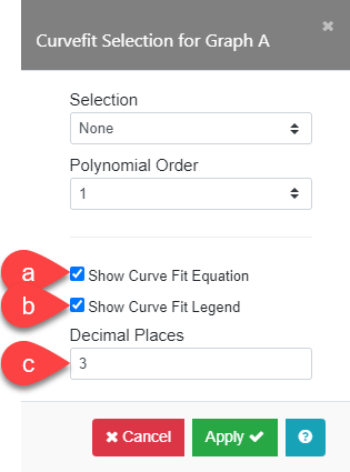
Show Curve Fit Equation and Legend
This option allows you to automatically display the Curve Fit equation and legend on your graph. Simply check the Show Curve Fit Equation box (a) and the Show Curve Fit Legend box (b).
You can optionally choose to limit the number of decimal places displayed. High-precision numbers are used in the curve fit calculation, and this yields an equation with a large number of decimal places. When you enter a value in the Decimal Places field (c), the equation is displayed in a more simplified form.
Note: The Exponential, Log, and Power fits take the absolute value of data before taking the log, and may not give the curve you expect if your data contains negative values. We recommend using one of the other curve fits in this case.
Hint: Select the curve line type, thickness, and color, as well as the fill area color, in the Curve Style menu.
Caution: If one of the axes on your plot is a Log axis, the curve fit coefficients may not be correct. To see the correct coefficients, set both the X and Y axes to Linear scale.
Examples of Linear and Polynomial Curve Fit using the same set of data are below.


Check Show Curve Fit Equation and Show Curve Legend in the Curvefit Selection menu. Enter “3” for Decimal Places to display the equations and legend for the curves.


Curve Style
The Curve Style options (a) define the color and line style for the curve fit chosen. The Fill below Curve box (b) when checked will fill the area below the curve with the color and pattern chosen for the curve fit line. Full Axis Curve (d) can be used to define the extent of the curve fit. By default, the curve fit is plotted across the entire graph extending beyond the data. If you don’t want to extrapolate the curve beyond the data, disable this option. The curve will only be drawn from the first X data point to the last X data point. The Label section will allow you to choose the font, size, and color for the curve fit equation.
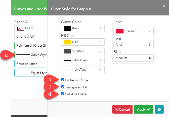

For the above example, check Fill below Curve and Transparent Fill (c) for the style of the fill area below the curve (Fill Color is set to “Gold” in this example). Set the Label color to “Crimson” for the curve equation.
Enter Equation
Click the Enter Equation field (a) to bring up a submenu to enter a user-defined equation of the form y = f(x). For more information see section on Entering Equations.
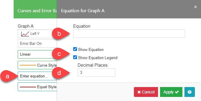
To enter an equation, enter the right side of the equation (without “y=”) into the Equation field (b). For example, for the equation y=sin(x)/x, enter “sin(x)/x”.
The equation will be plotted using the currently defined X and Y ranges for the current graph.
Important: If you do not have a graph defined, you must enter values for the Minimum and Maximum fields in both the X Axis Settings and Left or Right Y Axis Settings menus; otherwise, no equation will be plotted.
To display the equation and a legend for the equation, check the Show Equation and Show Equation Legend boxes (c). You can, optionally, choose to limit the number of decimal places displayed. High-precision numbers in the fit calculation are used, yielding an equation with a large number of decimal places. Enter a value in the Decimal Places field (d) to display a more simplified form.
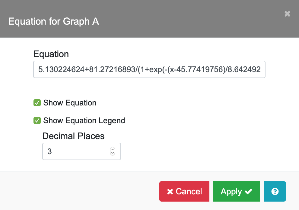
Notes: When you use the Curve Fitter in the Data Table tab toolbar to calculate the linear or nonlinear fit for your data series, you can save the Y Predict Equation in the Equation field (b) so that the equation will be displayed with the data series. For example:
After completing the Sigmoidal fit calculation in Nonlinear Curve Fitter, click on the Save tab. Select “Y Predict Equation” and enter “A” in the Destination Col field. The Sigmoidal equation will be saved in the Equation entry for Graph A.
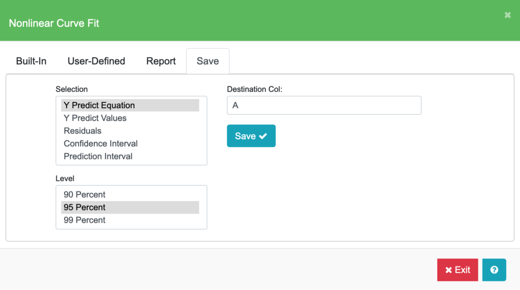
Click on the Equation entry for Graph A in the Curves and Error Bars menu to view the saved Sigmoidal equation. To remove the equation that is associated with a graph series, simply clear the entry in the Equation field.
Example
To generate the following graph, set the Minimum and Maximum fields to the values shown below in the X Axis Settings and Y Axis Settings tables. Set the Equation Color to “Royal Blue” and line thickness to 3-Thickness in the Equation Style submenu.
Graph A Equation: 2*sin(x)/x
Equation Style: Thickness 3

| X Axis Settings | |
|---|---|
| X Data Type | Number |
| Minimum | 0 |
| Maximum | 9.42 (3*PI) |
| Major Div: | 3 |
| Y Axis Settings | |
|---|---|
| Minimum | -2.5 |
| Maximum | 2.5 |
| Major Div | 2 |
| Minor Div | 5 |
Equation Style
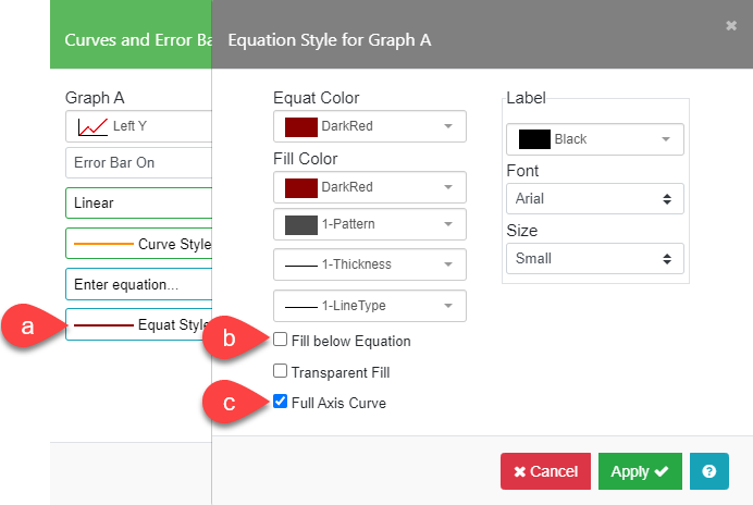
The Equation Style (a) options define the color and line style for the equation chosen. The Fill below Equation (b) box, when checked, will fill the area below the equation with the color and pattern chosen for the Equation line. Full Axis Curve (c) can be used to define the extent of the equation. By default, the equation is plotted across the entire graph extending beyond the data. If you don’t want to extrapolate the equation beyond the data, disable this option. The equation will only be drawn from the first X data point to the last X data point. The Label section will allow you to choose the font, size, and color for the equation.
Entering Equations
You can enter equations using rules listed below.
- Arithmetic operators supported include:
+ – e.g. –X, 3.5+X
^ e.g. X^2 (B squared)
*/ e.g. 2.5*X, sin(X)/X
- Expressions can be grouped with parentheses:
( ) e.g. (2+X)/5, (5*sin(X))/pi
- Variables and constants supported include:
| n | the value contained in the X series |
| en | 2.71828183 (base of natural logs) |
| pi | 3.14159265… |
- Functions supported by the equation evaluator include:
| abs(n) | absolute value of n |
| arccos(n) | arccosine of n returned in radians (0 to π) |
| arcsin(n) | arcsine of n returned in radians (-π/2 to π/2) |
| arctan(n) | arctangent of n returned in radians (-π/2 to π/2) |
| arctan2(m,n) | arctangent of m/n returned in radians (-π/2 to π/2) |
| ceil(n) | n rounded up to nearest integer |
| cos(n) | cosine of n in radians |
| cosh(n) | hyperbolic cosine of n |
| exp(n) | en raised to the power n |
| erf(n) | Gaussian error function of n |
| erfc(n) | complementary Gaussian error function of n |
| floor(n) | n rounded down to the nearest integer |
| ln(n) | the natural log (base en) of n (for n>0) |
| log(n) | the log (base 10) of n (for n>0) |
| mod(n,m) | n mod m (n=(i*m)+mod(n,m) where i = integer) |
| pow(n,m) | n raised to the power m (for n>=0 or n=-integer) |
| rand() | random number between 0 and 1 |
| sin(n) | sine of n in radians |
| sinh(n) | hyperbolic sine of n |
| sqrt(n) | square root of n (for n>=0) |
| tan(n) | tangent of n in radians |
| tanh(n) | hyperbolic tangent of n |
Note: All trigonometric functions work in radians.
radians *180/π = degrees degrees * π/180 = radians