

When you choose “Pie” in the Graph Type icon menu, you will notice the X Axis, Y Axis, and Curves & Error Bars side menu options are not available for Pie Charts.
Entering Pie Graph Data
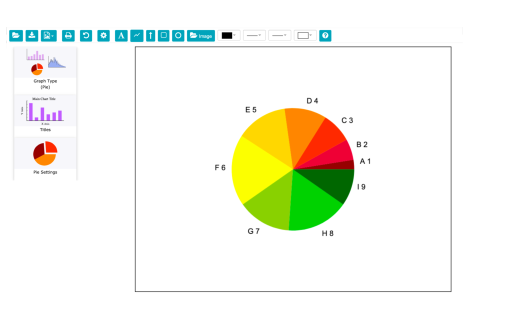
You can enter data for one or two pie graphs in the Data Table form. The segment data for pie graphs must be entered in the Graph A and Graph B columns. There can be up to 12 segments per pie.
- Enter the labels for each pie segment in the X Data column.
- Enter the data for Pie 1 in the A column and for Pie 2 in B column.


Important: Usually, the two pies share the same label (X) data. However, there are times when you might want to have different labels for each pie. To create two pies with different segment labels…
- Enter the labels for Pie 1 in the X Data column, then enter the labels for Pie 2 below these (up to 12 total labels).
- Enter the data for Pie 1 in the Graph A column adjacent to the labels for Pie 1. Enter the data for the Pie 2 in the Graph B column adjacent to the labels for Pie 2.


Entering Pie Graph Titles
Click the Titles icon to enter the Main Title and Subtitle. See the Titles section or more information on entering the graph titles.
Use the Drawing Tools to add Text to the chart like Pie 1 Subtitle and Pie 2 Subtitle. See the section Customize Chart for more information on entering Text.
Pie Settings
Click on the Pie Settings sidebar icon to display the Pie Settings menu.
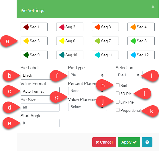
| a. Segments | You can select the color and pattern of each segment. You can also select segments to be displayed as exploded which pulls the segment slightly away from the center of the pie, drawing attention to the segment. 3D pie segments cannot be exploded. |
| b. Pie Label | When you select the Pie Label field, the Text Style menu that appears is the one used throughout the application. Here, you can select the style (color, font, size, etc.) for the value and percent labels. |
| c. Value Format | You can specify the format for the value and percent labels for each pie segment. This option works just like the options for X Axis Format. |
| d. Pie Size | You can change the size of a pie by entering a number from 1 to 100 in the Pie Size field. Size 100 is the largest pie that can be drawn, other sizes are proportionally smaller. Note: When the Proportional box (k) is checked, only the Pie Size of the largest pie is used. The smaller pie is proportionally sized to the larger one. |
| e. Start Angle | The Start Angle field adjusts the rotation of the first segment of the pie. Usually, the first slice starts at 0 degrees (3 o’clock position). Successive slices are drawn counter-clockwise. Hints: – Rotating a slice toward the top can help call attention to that segment. – If segment labels from two pies overlap, you can change the Start Angle for one of the pies, or adjust the sizing and spacing of the pies by direct manipulation. |
| f. Pie Type | You may display the data as a pie or in column form. Usually, if you want to link two pies, you can set the pie type for one pie to column for a “Pie exploding into column” effect. The Link Pie option (j) links the exploded segment from one pie to another pie or a column graph. You can suppress one pie when you set Pie Type to “None”. |
| g. Percent/Value Placement | Each pie segment can be labeled with its percentage of the pie and/or its value in one of four places – “None”, “Adjacent”, “Below”, and “Inside”. If the Percent Placement and the Value Placement are set to the same choice, the value is displayed first, followed by the percent. |
| h. Sort Value | Pie graph segments can be sorted and arranged in order of value from largest to smallest counter-clockwise on the graph. Unsorted segments are left in the order you entered them. |
| i. 3D Pie | The 3D Pie option lets you give pie charts a three-dimensional look. If all the pie slices are drawn with Pattern 1 (solid), a shade of the color is added to the side of the pie. Note that when the 3D Pie checkbox is selected, no segments are exploded. |
| j. Link Pie | You can link either two pie charts or a pie and a column graph to show one segment broken down into its components (see example below). The link is indicated with dotted lines from the first exploded pie segment to the second pie or column. See Example Notes: – If more than one segment in Pie 1 is exploded, the first one is used. – Start Angle is ignored when the Link Pie checkbox is selected. – Although 3D pie segments don’t explode, you must still check the Explode On checkbox to indicate the link. |
| k. Proportional | Proportional pie charts help you show the relative change from one set of data to another. This option makes the area of each pie proportional to the sum of its data. Notes: – Only the Pie Size of the largest pie is used. The smaller pie is proportionally sized to the larger one. – Negative (missing segment) values are treated as positive values for proportional pie calculations. |
| l. Selection | Choose between Pie 1 or Pie 2. |
Link Pie Example:
- In the Pie Settings menu, Click Seg 1 and check the Explode Section box.
- Check the Link Pie box.
- Select Pie 2 from the Selection list, then in the Pie Type field, select “Column”.


Missing Pie Segments
Negative values in the Data Table for the Graph A and B columns are displayed as missing pie segments or column segments. Space is allocated for the slice proportional to the absolute value of the number you type, but no actual segment is drawn.
Hint: You can use missing segments to build up a pie chart in a slide show. Your first chart can have just one segment, your second chart two segments, and so on until your last chart when the entire pie is revealed.