
The following example will demonstrate how to add titles, size the graph frame, customize your chart using the drawing tools, and add background color to the graph and the chart area.
- Create a new graph by clicking Graphs → Add New Graph… in TechGraph Online’s navigation bar.
- In the TechGraph Editor, click on the X Data (Label) header and choose X Data Type: “Label” and Graph Type: “Bar”.
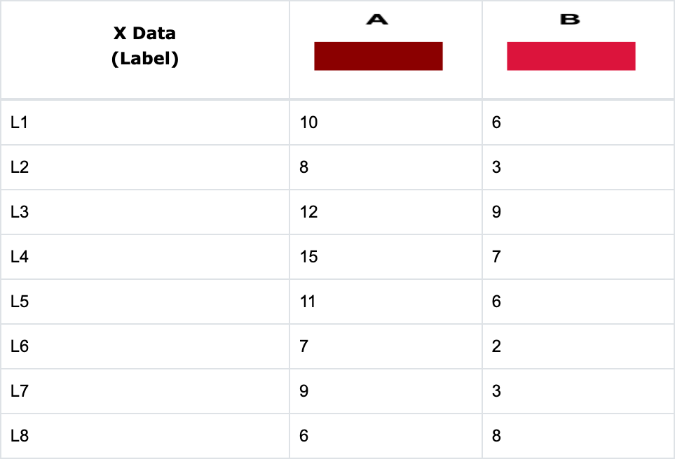
- Enter the following data into the Data Table. The resulting chart is shown below.

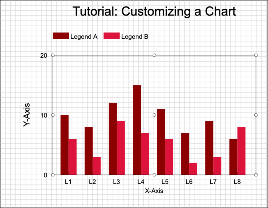
- To add a title and label the axes, switch to the Edit Chart tab and click the Titles icon in the side menu for the Title Settings menu to appear. Enter text for the title in the Title field (a). You can choose up to five standard options in the Selection field (b).
- First, enter “Tutorial: Customizing a Chart” in the Title entry field (a).
- Then, select “X Axis” in the Selection field and enter “X Axis” in the Title entry field.
- Select “Left Y Axis” in the Selection field and enter “Y Axis” in the Title entry field.
Click Apply and all three titles will appear on the resulting chart as displayed below. Using the same menu, you can change the title colors, font type, text size, and justification.


- Now, let’s move and resize the graph frame and move the legend and main title. You can also check the Grid On option in the Grid & Chart Background Setup button menu in the Edit Chart toolbar to provide a layout guide for moving and resizing. Click on the center area of the graph – the area will be outlined with “bubbles” at the corners of the graph frame and a “move” bubble in the center as shown below.
- Grab the center bubble and move the graph frame to the left to shrink the left margin.
- Grab one of the right bubbles to expand the size of the graph frame.
- Click on the legend, grab the center bubble, and move the legend inside the graph frame.
- Click on the title, grab the center bubble, and move the title down closer to the top of the graph frame.
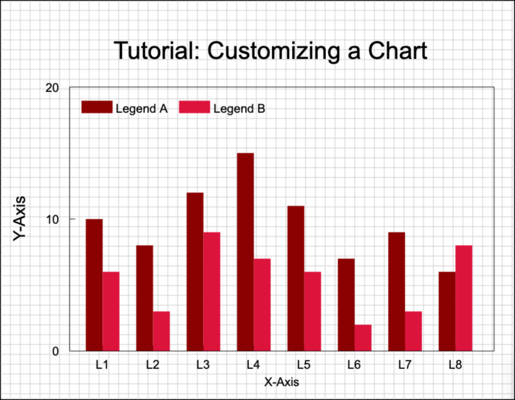
Note: You will notice that the Title will not move with the graph. Once you manually move something in the chart area, it will remain in that position until it is manually moved again.
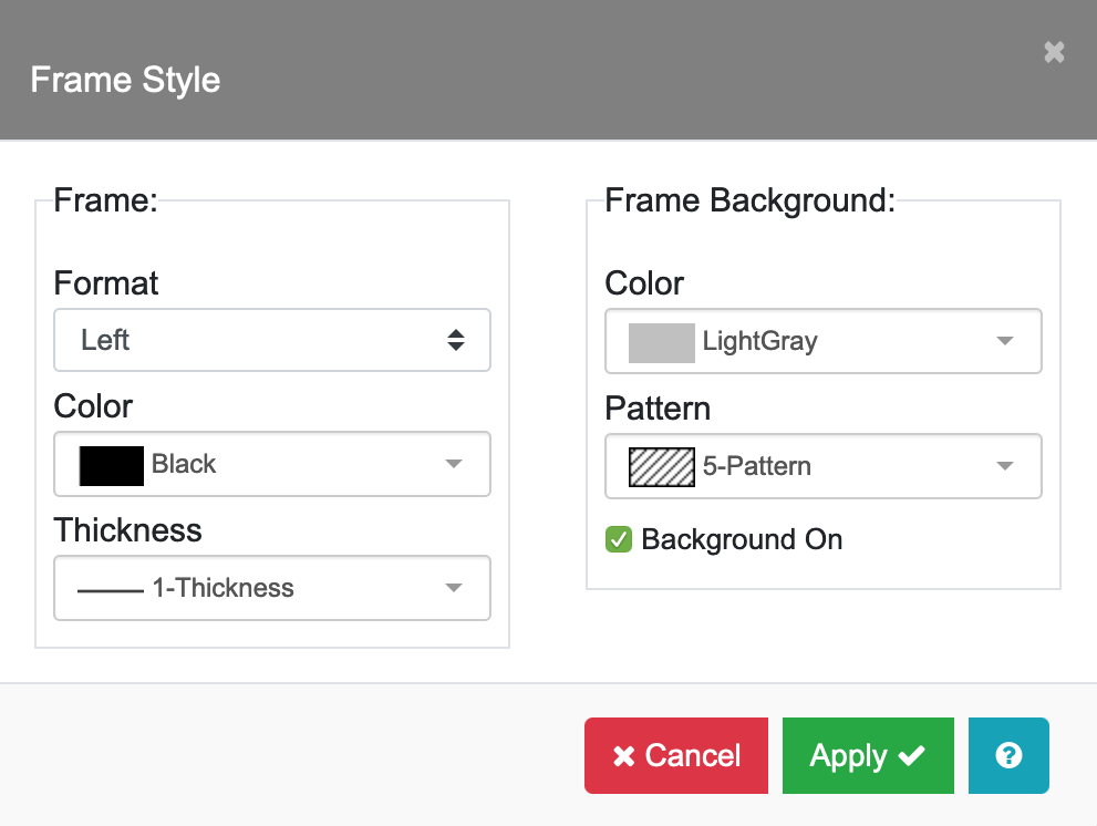
- Next, let’s change the graph frame to only have a left and bottom axis and set a background color for the graph. Click the Settings icon, then click the Frame Style/Bkgrd field and the Frame Style menu will appear. Change the Frame Format to “Left”. In the Frame Background section, select “LightGray” for Color and “5-Pattern” for Pattern. Finally, check the Background On option and click Apply.

- Now, let’s add some text to annotate the chart and frame that text with a box. On the Edit Chart toolbar, click the Text button. Move your cursor below the “X-Axis” label, click and hold the left mouse button to drag and draw a text box. Add your desired text in the Label Settings dialog box that appears.
- Next, click the Box button. Move your cursor to the lower-left corner of the text, click and hold the left mouse button to drag and draw a box around the text. You can move the text and the box independently to center them under the title.
- Finally, let’s add an image (in this example, we use our logo). On the Edit Chart toolbar, click the Image button. The button should be colored blue when active/selected. Move your cursor to the lower-left corner of where you wish to place your image, click and hold the left mouse button to drag and draw a bounding box for the image. Select the image file from your local device’s file system and it will appear within the bounding box. The final resulting chart is shown below.
