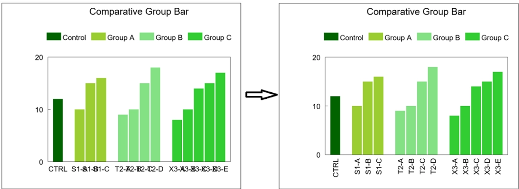
If you have many data points along the X-axis, you might find that the labels overlap like the graph below. It is now easy to fix the overlapping labels:
- Click on any X-axis label to select the labels.
- Click the “Edit” button in the toolbar.
- Change the Justify option from Center to Sideways or Diagonal and press “Apply”.
Here’s a video of how to change the Justify option for the X-axis labels with a few simple clicks (click the speaker icon in the player for audio):
Hints for Fixing Overlapping Labels
In the Label popup, select the Sideways or Diagonal option in the Justify list or select a smaller font size in the Size list.
Abbreviate or shorten the contents of the X labels in the X Data column or the Legend contents for Box Whisker chart
Changing the Justify option might change the height and position of the chart frame. Shorten the labels so they don’t take up too much room below the frame. Or select the frame to change the size and position.
Switching from Centered to Sideways X-Axis Labels
Switching from Centered to Diagonal X-Axis Labels

Leave A Comment
You must be logged in to post a comment.